How to Light 3D-Printed Channel Letters Evenly: Front, Halo & Side-Lit
Published Updated
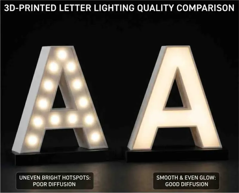
Lighting is what separates a professional channel-letter sign from an amateur one. You can print and finish a flawless set of letters, but if the illumination is patchy – bright hotspots over each LED, or dark gaps in the corners – the whole sign looks cheap. Even, clean illumination is the mark of quality.
This guide covers how to light 3D-printed channel letters properly, across the three main effects: front-lit, halo-lit and side-lit.
Even light starts before the LEDs
Two things determine evenness before you fit a single module, and they’re easy to overlook:
- The material and face. HFPC is formulated with strong light diffusion, which helps spread light smoothly across the face and hide hotspots. The translucency of the face is a trade-off: a more translucent face is brighter but shows hotspots more readily, while a more diffuse, opal face hides them at the cost of some brightness. Choose to suit the letter depth and look you’re after.
- The inside of the letter. A white or reflective interior bounces light around and dramatically improves both brightness and evenness. A dark interior absorbs light and makes hotspots worse. If you’re not printing in a light material, paint the inside of the returns white.
Get these right and the LEDs have far less work to do.
Front-lit letters: the high-street classic
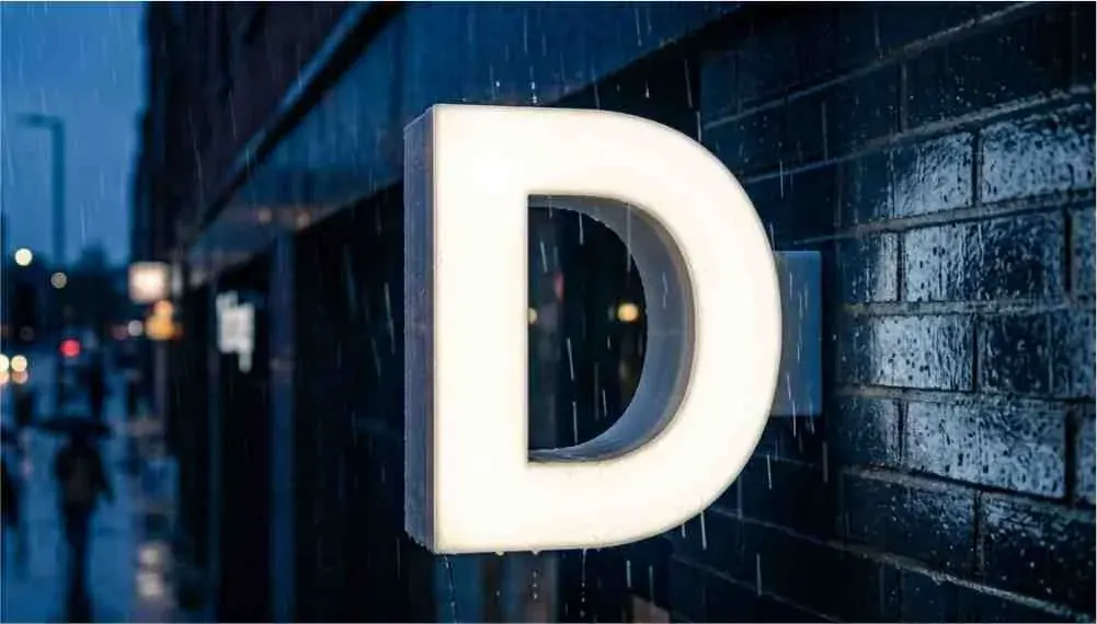
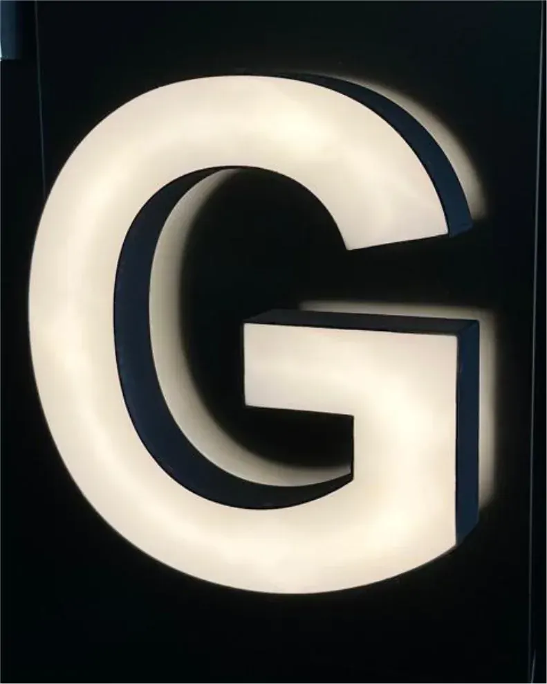
Front-lit letters glow through the face – the bold, bright look most retailers picture. The key to lighting them evenly is the relationship between return depth, LED spacing and beam angle:
- Return depth. The deeper the letter, the more room the light has to spread before it reaches the face, so deeper letters illuminate more evenly. Shallow letters are the ones most prone to hotspots directly over each LED.
- Beam angle. Wide-angle LED modules (commonly around 160-170°) spread light better and reduce hotspots compared with narrow-beam modules. For shallow letters, wide-angle modules matter even more.
- Spacing. Space modules evenly and make sure light reaches the whole letter – more on placement below.
If a shallow, translucent letter is showing hotspots, your options are a more diffuse face, wider-beam modules, closer module spacing, or a slightly deeper return.
Halo-lit (back-lit) letters: the premium glow
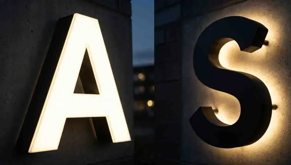
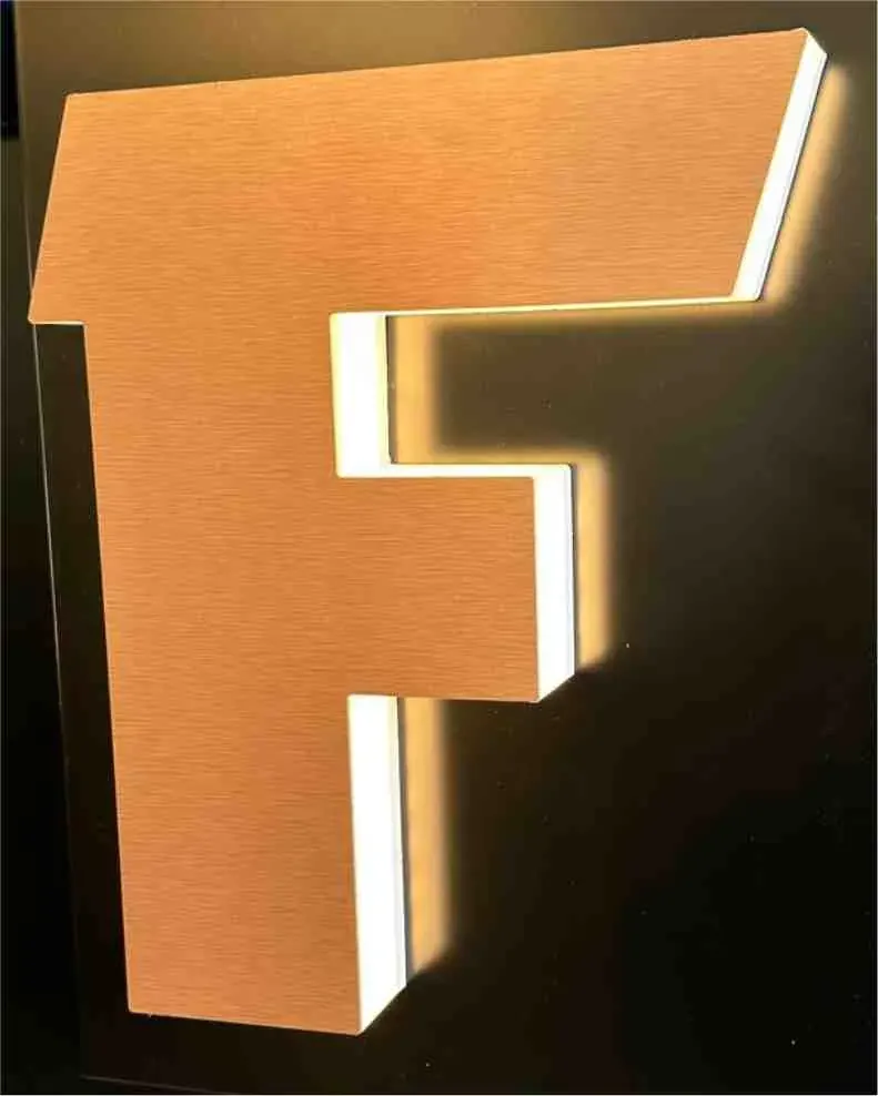
Halo lighting puts the LEDs at the back of the letter, facing the wall, so light washes out around the letter for a soft, upmarket glow – particularly effective at night. Evenness here depends on:
- Standoff distance. The letter is mounted off the wall on spacers (typically around 25-50 mm). Too close and you get a tight, bright ring or visible hotspots; too far and the halo washes out and weakens. This distance is the single biggest factor in a clean halo, so it’s worth testing.
- Even perimeter placement. Distribute the rear LEDs evenly around the shape so the halo is consistent all the way around, with no bright patches or gaps.
- The face. Halo letters usually have an opaque face (the glow comes from behind, not through), so face translucency isn’t the issue here – placement and standoff are.
- The wall. A lighter wall reflects the halo better; a very dark wall absorbs it. Factor the wall colour into how bright you make the letters.
Side-lit letters: the contemporary look
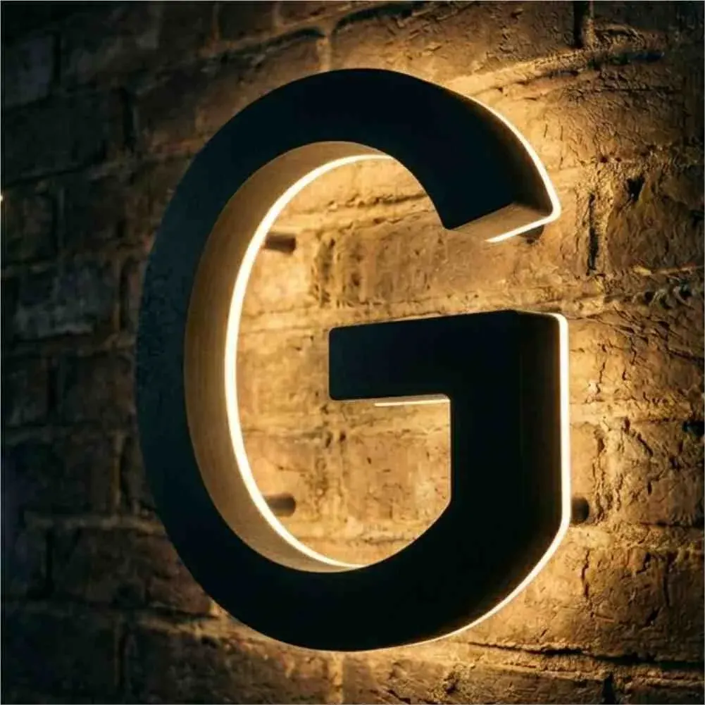
Side-lit letters emit light from the returns themselves, for a distinctive modern effect. This needs translucent return material and LEDs positioned to illuminate the sides evenly. As with front-lighting, even spacing and a reflective interior help avoid bright and dark patches along the returns.
Choosing your LED modules
A few decisions shape both the look and the evenness:
- Colour temperature. Warm white (around 3000K) for a softer, premium feel; neutral (around 4000K) as a versatile middle ground; cool white (around 6500K) for a crisp, bright look. Match it to the brand and the environment.
- Colour matching. For coloured signs, make sure the LED colour suits the face colour so the brand reads correctly day and night.
- RGB / colour-changing. For dynamic signs, use RGB or RGBW modules with a suitable controller (app- or DMX-controlled). Pay extra attention to diffusion, as colour mixing can show unevenness.
- Brightness and beam angle. Choose module output to suit the letter size and ambient brightness, and favour wide beam angles for even spread.
Spacing and placement: the key to no hotspots and no dark spots
This is where most evenness problems are won or lost:
- Space modules evenly throughout each letter, not just down the middle.
- Get light into the extremities – corners, tight curves, the ends of strokes and the counters of letters like “a”, “e” and “o”. These are where dark spots appear if you skimp.
- Go denser for small or thin letters. Narrow strokes have little room to spread light, so they need closer spacing (and often wider-beam modules) to look even.
- Use return depth as your guide. Deeper letters tolerate wider spacing; shallow ones need modules closer together.
Wiring and power: doing it safely and reliably
Good lighting is also about the electrics behind it:
- Calculate the load. Add up the wattage of all the modules so you can size the power supply correctly, with some headroom.
- Choose the right driver/PSU. Signage LEDs typically run at 12V or 24V; 24V systems handle longer runs with less voltage drop, which helps keep brightness even across a large sign.
- Respect run-length limits. Every module string has a maximum run length. Exceed it and you get voltage drop – the far end of the run dims noticeably. Wire in parallel and split long runs as the spec requires.
- Weatherproof everything outdoors. For exterior signs, use IP-rated modules and a suitably rated, enclosed power supply (often housed in the raceway or a separate enclosure), with sealed connections. The electrics – not the plastic – are the most common point of failure on a cheap outdoor sign, as we cover in our guide to whether 3D-printed signs are weatherproof.
- Use a qualified electrician for the mains connection and follow the relevant electrical regulations.
Always test before you install
Never assume the lighting is right until you’ve seen it. Power up the finished letters and view them in a dark environment before final assembly and installation – that’s the only reliable way to spot hotspots, dark corners or uneven runs while you can still fix them. Adjust module spacing or standoff, then re-test. Ten minutes of testing on the bench saves a call-back after install.
Common lighting mistakes to avoid
Most poor-looking signs come down to a short list: too few LEDs or uneven spacing (dark patches), shallow returns with an over-translucent face (hotspots), a dark interior absorbing light, runs that are too long (dimming at the far end), the wrong colour temperature for the brand, or non-IP electronics used outdoors. Our guide to the 12 most common channel-letter issues covers how to diagnose and fix each one.
Frequently asked questions
How do I stop hotspots in channel letters? Use a deeper return, wide-beam LED modules, even and sufficiently dense spacing, a reflective white interior, and a face with enough diffusion. HFPC’s light-diffusing properties help. If hotspots persist on a shallow letter, increase diffusion or module density.
What’s the best LED spacing for channel letters? There’s no single number – it depends on letter depth, size and stroke width. Deeper, larger letters tolerate wider spacing; small or thin letters need modules closer together, with light pushed into every corner and curve. Always test in the dark and adjust.
How far off the wall should halo-lit letters be mounted? Typically around 25-50 mm, but test it: too close gives a hard, hot ring and too far washes the halo out. The standoff distance is the biggest factor in a clean, even halo.
Can 3D-printed channel letters be RGB or colour-changing? Yes – use RGB or RGBW modules with a suitable controller. Pay particular attention to diffusion so the colour mixes evenly across the face.
What colour temperature should I use? Warm white (≈3000K) for a premium, softer look; neutral (≈4000K) as a flexible default; cool white (≈6500K) for maximum crispness. Match it to the brand and the setting.
Want help getting the lighting right?
Even illumination is one of the things that most sets professional 3D-printed signage apart – and it’s easy once you’ve seen it done. Book a demo and we’ll walk you through lighting front-lit, halo and side-lit letters on the machine that suits your shop. To see the full production process, start with our workflow guide.